Yay for blog designing!
Even though I'm still trying to figure out how Gimp works and all that, it's alot of fun. I've done four so far...just messing around with getting measurements, etc. Let's take a look! {If you dare...mwahaha!}
Try 1: This took me a long time, and it's not the cutest. I was too busy {looking back at the tutorial page a billion times to see what I should do} to worry about making it look too cute. Maybe not toooo bad for a first try. Except the really narrow space for your actual blog to go in. *cough*
Try 2: Cute basic look, but the ribbons are too stretched out looking, and {you can't see it in the picture, because it's over a white background} there's some space at the sides. Still not quite sure what happened there. The middle space was also still a little too narrow.
Moving on...
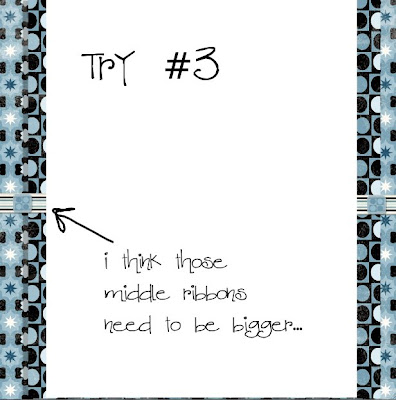
Try 3: I finally made the middle space wide enough {I think!}. Looks pretty nice, except for the side ribbons could use some resizing to make them bigger.
Try 4: Yay, I remembered to made the middle space wide enough again! Maybe I'm starting to get the hang of it. :)
Lydia gets here tonight! We'll leave for the airport after supper. It's going to be so good having her here for a visit! I almost feel like I should make her her own blog label. Labels: "The List", Bible, Random, Eatables, Lydia....
:)
Happy Friday!


No comments:
Post a Comment